


A podcast aimed at addressing health-related misinformation in pop culture by presenting evidence-based medical knowledge in a fun and engaging way.
Hashtag Health is a new podcast aimed at addressing health-related misinformation in pop culture by presenting evidence-based medical knowledge in a fun and engaging way.
Show host, Nafis Hossain, interviews medical doctors, researchers and sometimes even patients.
All my podcast branding project start with research, which includes scouting out the competition and identifying ways to make your podcast stand out from the crowd. Hashtag Health holds credibility both because of the medical background of their staff, and the experts that are interviewed on the show. The aim was to convey that credibility without giving off a stuffy, boring vibe. We want the podcast to appear trustworthy, but also fun and accessible to potential listeners.
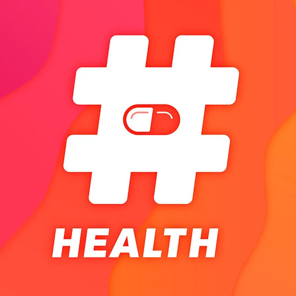
Sketching allowed me to work through a variety of potential concepts; honing and trimming as I worked.The decision was made to make the hashtag (or pound sign) the primary focus of the cover art. This would create an immediate association with pop culture while allowing a single strong object to stand out at the small sizes that podcast covers are often viewed.
I wanted to use the negative space in the primary icon communicate something about the subject of the show. For me, working with geometric shapes and negative space is much quicker in Illustrator than with pencil and paper, so I quickly moved to my digital workspace to flesh out the core concept of the design.
Ultimately, a pill shape was used to suggest the concept of all the “magic pills” and other snake oil types of misinformation that are out there.
A geometric san serif turned out to be a natural fit for this design. Something with enough weight to sit comfortably with the icon. Ultimately, I chose Upgrade Bold Italic and customized the letters to match the angle of the hashtag. The consistent angle ties the composition together and brings an element of energy or motion to the design.
It was important to the client that the colors give off a more energetic vibe rather than the calm of cooler colors. As I honed the color palette and overall composition, I decided that to introduce gradients to bring more visual interest and energy to the cover art.
The final cover art is impactful, clever and fun. The bright, warm background with it’s varied hues and gradients draws attention and provides plenty of contrast for the primary icon to do the heavy-lifting.
Since podcast platforms always list the show name along with the cover art we can let the symbol stand on its own rather than spelling out the literal word ‘hashtag’. This approach makes for a more efficient and impactful cover; one that will certainly stand out from the crowd.
The strong, simple shapes and typography of the foreground allow the design to reproduce very well at small sizes without sacrificing legibility.The subject matter is abundantly clear and the tone of the podcast shows through as well. Overall, the design implies an energetic, helpful and fun show without tipping into the realm of frivolity.