


Trade Mark Solutions is a business consulting agency serving small to mid-sized residential plumbing and HVAC businesses. They are focused on the younger generations of entrepreneurs and tradespeople rather than the ‘old guard’.
Trade Mark seeks to differentiate from the competition with a more modern approach that is nimble and tailored to each client while keeping the barriers to entry very low
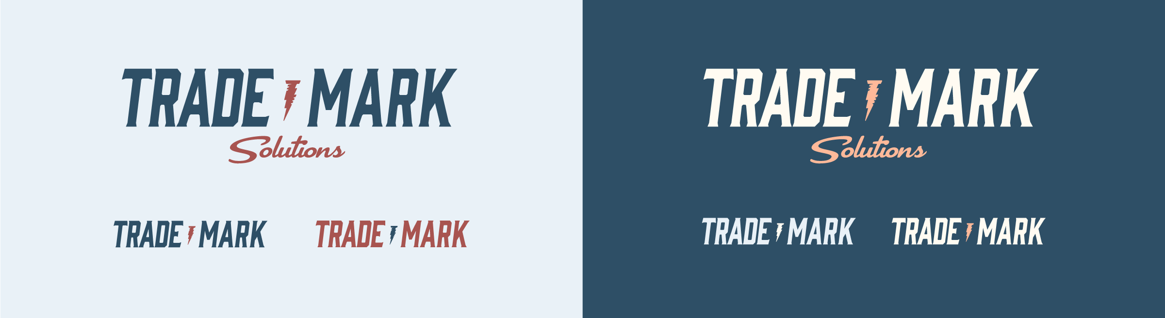
The Trade Mark Solutions brand is bold, recognizable, and built to make an impression without feeling repetitive or constraining. It’s grounded and approachable, yet sharp, focused, and modern. Wherever it shows up, the brand aims to engage, surprise, and connect in meaningful ways.
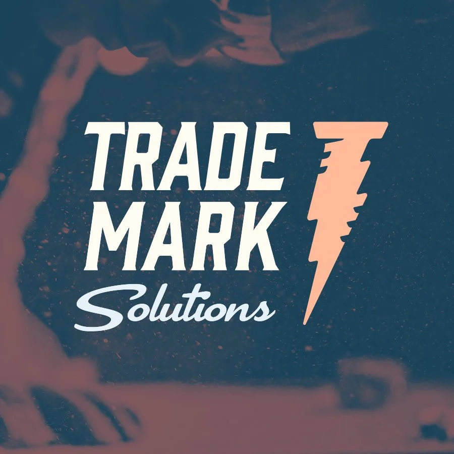
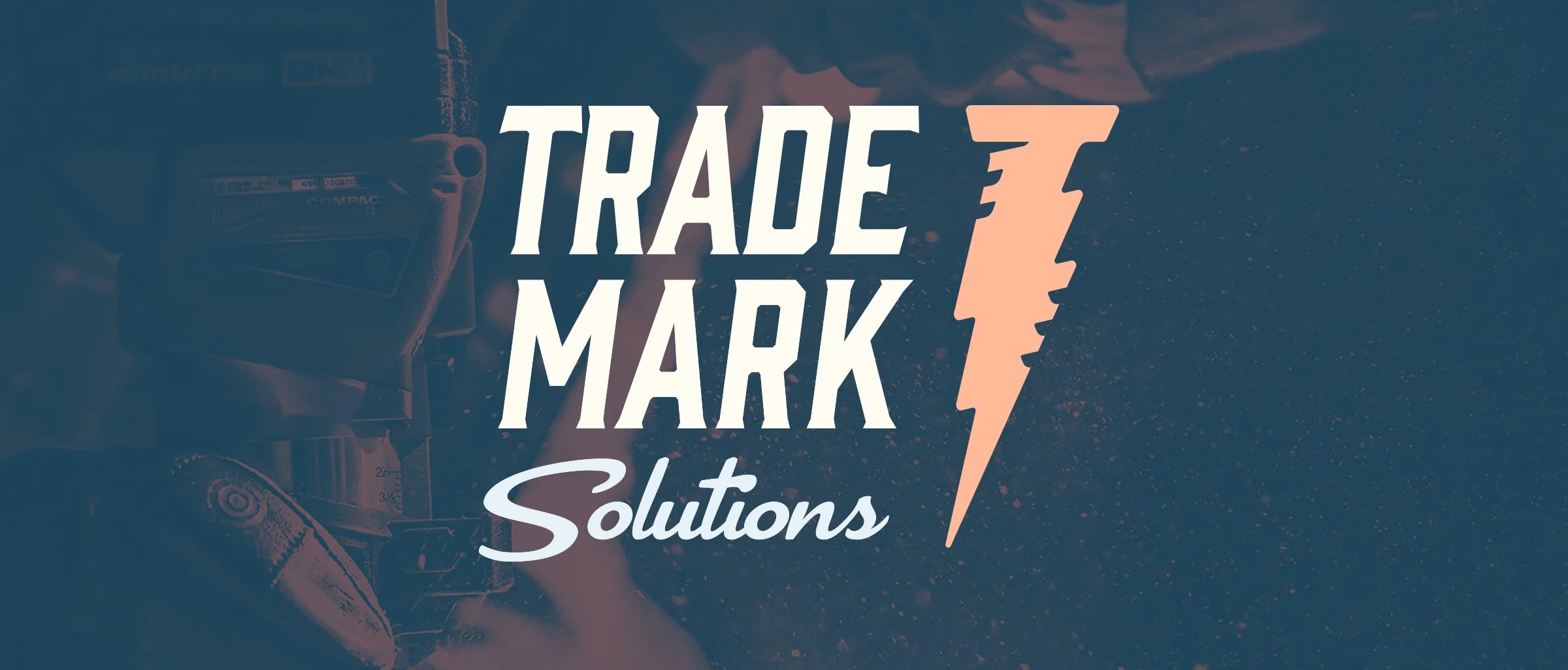
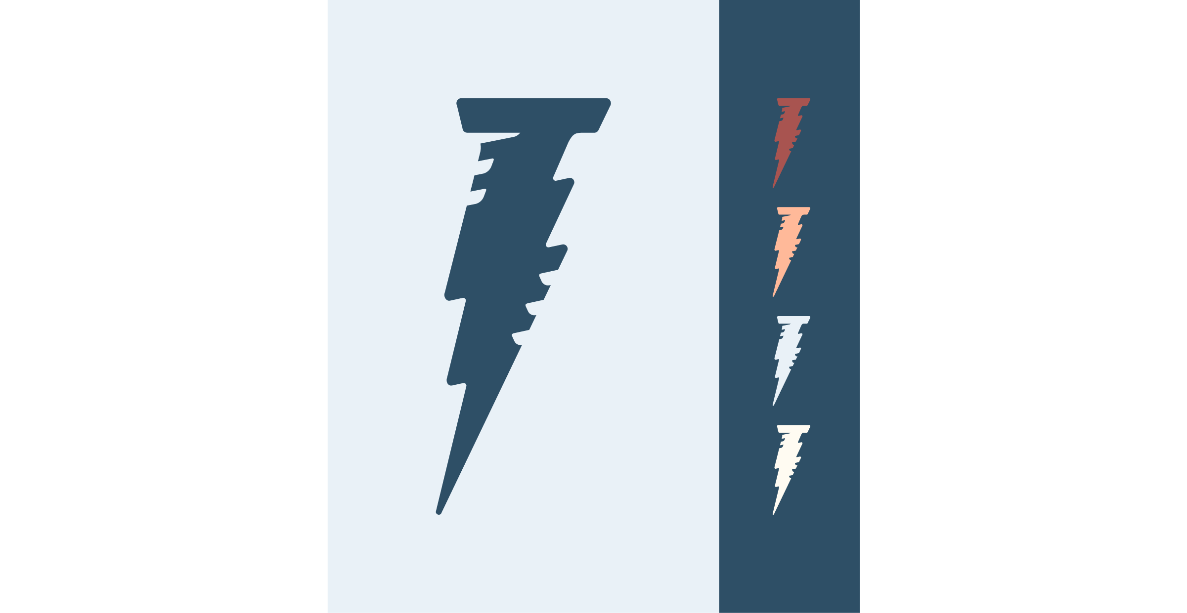
The Lightning Nail logomark is the cornerstone of this visual identity. It signals the industry Trade Mark operates in while standing out as a distinctive, recognizable, and ownable symbol. The mark should appear often, not only when space is limited, but also in moments where its bold, simple form can create a strong and memorable impression.
The Trade Mark logo system is built to be both flexible and expressive; adaptable across all use cases while consistently reflecting the brand’s tone and character.
The palette reflects Trade Mark Solutions’ modern, grounded, and trustworthy personality, while standing apart from more traditional competitors in the trade consulting space.
These colors break from industry clichés while still feeling familiar to tradespeople.
The palette performs well in both light and dark interfaces, taking accessibility into consideration, and adapts easily across web, print, and apparel.
The tones are emotionally resonant (trust, grit, precision) but not distracting; they support the content and message, not compete with it.
The relative sizes of the color blocks approximate the prevalence of each color within the Trade Mark visual identity.
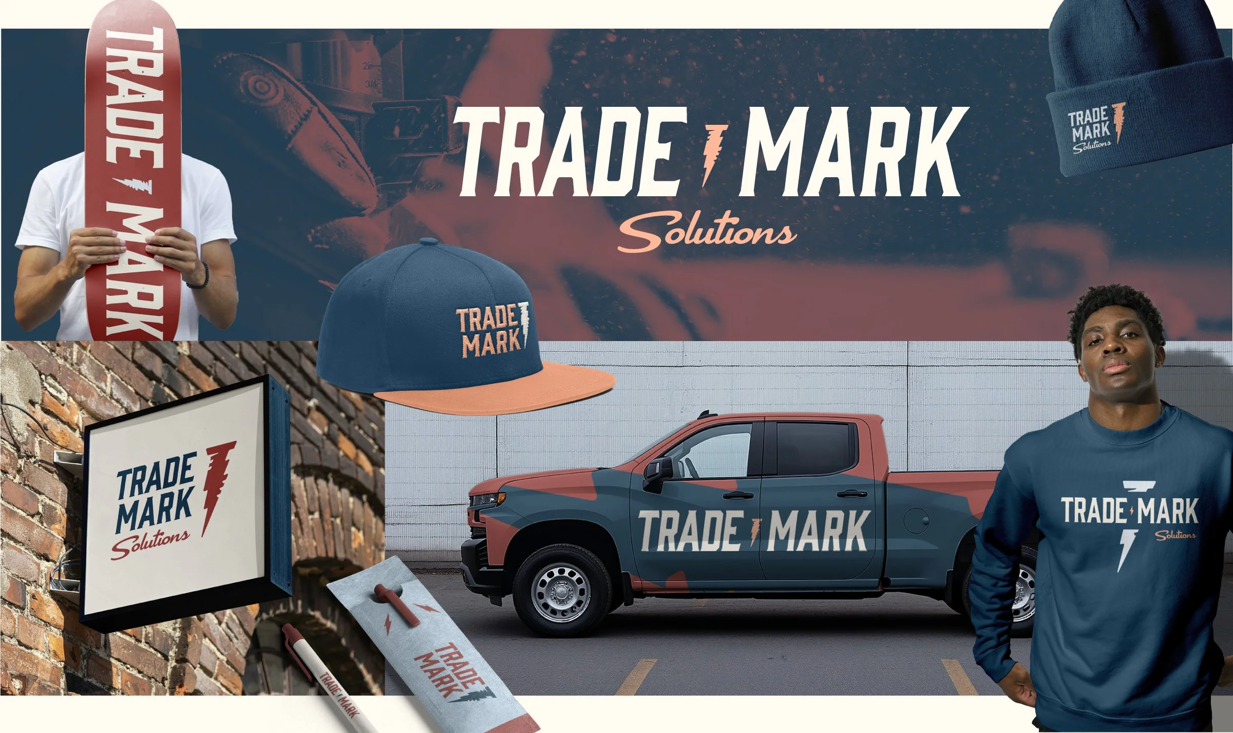
Trade Mark is a brand that both employees and customers are proud to show off. High-quality, thoughtfully designed merchandise is central to how the brand shows up in the world.
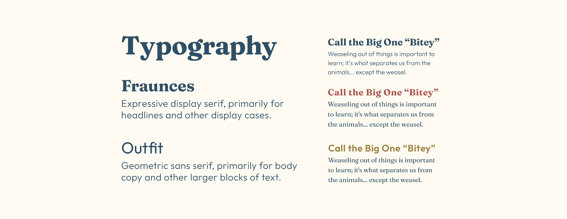
Fraunces brings warmth, contrast, and a touch of character, nodding subtly to craftsmanship; a fitting reference for this trade-focused audience. Outfit balances the palette with clean, modern geometry that feels straightforward and approachable, reinforcing Trade Mark Solutions as a forward-thinking brand.
Together, they offer strong tonal contrast while staying cohesive and scaling well across everything from billboards to mobile apps. Fraunces captures attention without overwhelming; Outfit ensures clarity and readability in all formats.
This “Brand Preview” was built to help the client envision how the brand could look in action. This helped us finalized decisions before creating the full Brand Guidelines.